Statistically Significant Death Cross?
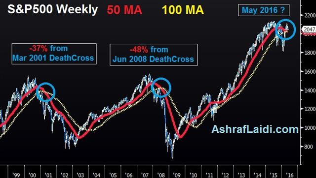
The S&P500 is currently showing a pattern seen in June 2008 and March 2001, both cases in which the index lost more than 30%. The 50-week moving average is crossing below the 100-week moving average, a pattern whose importance has been highlighted by its rarity and consequence.

The chart below shows the June 2008 weekly 55-100 Death Cross was followed by a 48% decline in the S&P500, while the March 2001 weekly 55-100 DC was followed by a 37% drop.
Equally significant –and addressing a typical criticism of Death Crosses in that they often occur after the bulk of the move had been played out)—both of the March 2001 and June 2008 DC emerged after the market had already fallen 29% and 19% off its peak respectively.
Applying the pattern to today's markets, equity indices appear significantly more stable than in 2001 and 2008, with the index off its highs by no more than 5%.
Yet, how do we relate the fact that stocks have not yet their highs in 12 months, the longest period without a new record since the 5 years elapsing between 2007 and early 2013.
May 21st marks the 1-year anniversary of the stock market high (SPX record was on May 21st, Dow record on May 22nd).12 months without a new high in equity indices is the longest since the 5 years and 5 months (from the Oct 2007 high to the March 2013 high). Interestingly, the 2013 high emerged on the heels of the Fed's announcement of QE3 two months earlier.
The Fed's efforts to convince markets that a second rate hike is viable are increasingly being ignored by FX and bond markets, while equities remain tied to a triangular correlation, which spells more slow pain for risk appetite, higher volatility, steady yen and weak yields.


